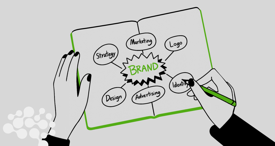
So, here’s the thing about brand visuals right now: they’re loud, they’re moving, and they’re very much alive. The old idea of a brand having just a nice logo and a color palette? That’s done. These days, your brand identity needs to work like a living, breathing character, one that shows up across Instagram, your pitch deck, a podcast thumbnail, and your app, without missing a beat.
And because everything is so visual now (scroll culture, anyone?), design trends are evolving faster than ever. Some are bold, some are weird, and some are straight-up nostalgic.
Let’s talk about the five big ones we’re seeing everywhere right now.
1. Maximalism Is Having Its Main Character Moment
Remember when everything was super clean and minimal? White space, sans-serif fonts, maybe a tiny splash of navy or blush? Well, that’s not where we are anymore.
Right now, maximalism is strutting in like, “Hi. I’m here to cause a scene.” We’re talking loud color clashes, chunky hand-drawn doodles, layered textures, busy grids, chaotic-but-cool layouts. It’s bold, busy, and honestly… kind of beautiful.
But it’s not chaos for the sake of chaos. The brands doing this well are using maximalism to build a personality that feels unique. Liquid Death? Killing it. Streetwear labels? Thriving in this vibe. Even some SaaS brands are testing the waters.
Why it works:
People scroll fast. Maximalism grabs attention and says, “Stop. Look. Feel something.”
2. Motion Isn’t Just for Videos Anymore
This one’s huge. Motion design has officially moved out of the video editor’s corner and into everyday branding. Logos that gently morph. Headers that shift as you scroll. Button hovers that feel like butter.
It’s not just about cool effects, it’s about adding life to your brand system. These tiny movements can express your tone in ways static design can’t. Whether it’s playful bounce, slow elegance, or energetic snap, motion is the new voiceover.
Here’s the trick:
Don’t overdo it. Motion should enhance your story, not distract from it. Use it to guide attention, reinforce mood, or reward interaction.
3. The Y2K + Retro-Future Mashup
If you’ve opened the internet lately, you’ve probably seen this one. Chrome text, bubbly gradients, glitchy VHS textures, pixel fonts, basically the lovechild of 1999 and 2099. It’s giving “Windows 95 meets Club Penguin meets Blade Runner.”
What’s interesting is how this trend manages to feel both nostalgic and futuristic. It tugs at childhood memories (for millennials and Gen Z at least) while still feeling experimental and edgy.
Who’s using it?
Fashion labels, digital products, music brands, and honestly… a lot of creators who just want to vibe.
Will it last?
It’s probably a phase, but it’s having a strong run. And if it fits your brand voice, it can be a wild and fun way to stand out.
4. Realness Over Gloss
Stock photos are going out of fashion faster than you can say “smiling businesswoman with arms crossed.” Instead, brands are getting way more real. Think: behind-the-scenes shots, team selfies, real customer videos, and even lo-fi content filmed on a phone.
The goal? Trust. People want to see humans, not polished models pretending to be customer service agents. Even big-budget brands are embracing this raw, documentary-style vibe.
Why it matters:
Authenticity builds credibility. It’s easier to trust a brand that looks like it’s run by actual people.
Quick tip:
You don’t need to sacrifice quality, just show your messy desk once in a while. Or your dog. Or that weird in-between moment before your product launch.
5. Modular Brand Systems Are the New Manual
This one’s a little nerdy, but it’s super important. Gone are the days when a brand identity was a PDF guide with five logo lockups and “don’t stretch the logo” warnings.
Now, brands are thinking in systems. They’re creating flexible, modular identities that can shift shape depending on where they show up. So maybe your Instagram logo is animated, your packaging mark is more playful, and your internal docs use a stripped-down type treatment.
Why this is smart:
It keeps things fresh without losing consistency. You’re not stuck in one visual mode, you can adapt, remix, and still stay recognizably you.
The bonus:
This approach is super handy for social, collabs, events, or anytime you want to try something new without doing a full rebrand.
Listen…
Here’s the thing: you don’t need to jump on every trend. The goal isn’t to be trendy for the sake of it, it’s to stay visually relevant in a way that still feels true to your brand’s personality.
These trends are just signals. They tell you where attention is flowing and what kinds of visuals people are engaging with. So use them as inspiration. Mix them with your own aesthetic. See what fits.
Try testing a motion graphic in your next campaign. Or lean into some retro elements for a limited-time drop. Or just start showing more of your real team, raw and unfiltered.
Because in the end, brand identity is about connection. And visuals are how you make people feel something before they even read a single word.