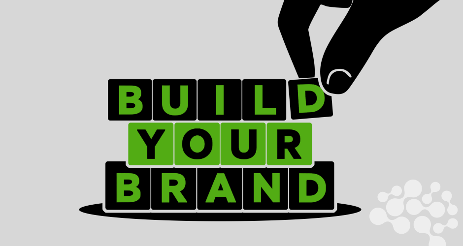
A brand’s visual identity is like a first impression; it only takes a few seconds for someone to form a gut feeling based on what they see. And in today’s super-saturated digital world, aesthetics aren’t just about looking good. They’re about standing out, building trust, and communicating who you are before a single word is read.
But if your brand visuals still feel stuck in 2016 (or earlier), you’re probably missing out on relevance and resonance. So let’s talk about the design trends that are making brands look, feel, and perform fresher in 2025.
Here are 6 trends that can breathe new life into your brand’s visual presence.
1. Minimalism with Personality
Clean, clutter-free design isn’t going anywhere. But what’s changing is the character that minimalism brings. Brands are now injecting subtle quirks into simple layouts, unexpected color accents, playful typography, or asymmetrical compositions, that help avoid the cookie-cutter look.
Think of it like this: minimal design is the frame, but the personality is the art inside it.
How to apply it:
- Keep layouts clean, but experiment with bold type pairings or micro-animations.
- Use whitespace intentionally, not excessively.
- Embrace a signature detail (like a hand-drawn icon or funky shape) that gives your brand its edge.
2. Retro-Futurism: The Past Meets Tomorrow
We’re seeing a rise in designs that combine nostalgic references with modern techniques. It’s less about vintage for vintage’s sake, and more about weaving emotional resonance from the past into cutting-edge aesthetics.
Think gradients inspired by 90s desktop wallpapers, pixel fonts, or neon outlines, but all balanced with today’s sleek UX principles.
Why it works:
Retro-futurism feels familiar and fresh. It taps into collective memory while signaling that your brand isn’t afraid to take visual risks.
Use with care:
- Combine retro textures or patterns with modern layouts.
- Anchor nostalgia with clean visuals so things don’t get overwhelming.
3. Custom Typography Takes Center Stage
Fonts are no longer just functional; they’re fast becoming the star of the show. Custom typefaces, expressive display fonts, and oversized letterforms are pushing logos, headlines, and brand systems into memorable territory.
In an age where AI-generated assets are everywhere, a distinctive type choice (or custom lettering) feels human and handcrafted.
How to modernize your type game:
- Swap your standard sans-serif for something with character.
- Don’t be afraid to go big with your headlines, literally.
- If budget allows, commission a custom font that reflects your brand’s vibe.
4. Dynamic Brand Systems
Your logo shouldn’t be the only consistent piece in your visual identity anymore. Brands today are embracing flexible design systems that adapt across formats, static, animated, vertical, square, mobile, billboard, you name it.
What’s trending is modular branding: a toolkit of visual assets (patterns, stickers, illustrations, motion graphics) that can flex without losing cohesion.
Why it matters:
It future-proofs your identity. Whether it’s for a static post, a TikTok video, or an AR activation, your brand stays recognizable but not repetitive.
Tips to implement:
- Develop visual assets beyond the logo: think brand shapes, motion guidelines, or tone-setting gradients.
- Build a system that works for social, digital, and physical formats.
- Think of brand consistency more like jazz than like a marching band, structured but expressive.
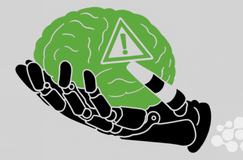
5. AI-Aided Design, with a Human Touch
Let’s be real, AI design tools are here, and they’re not going anywhere. From generating quick mockups to customizing visuals at scale, brands are using AI to speed up workflows and spark inspiration.
But here’s the catch: the real impact comes when humans layer emotion, nuance, and intention on top of that output.
The new workflow:
- Use AI to explore creative directions or build first drafts.
- Refine and humanize with your creative team to add warmth and precision.
- Emphasize your unique brand lens, because AI can’t replicate your intuition or values.
6. Accessible and Inclusive Design
Design that’s modern must be inclusive. Accessibility isn’t a trend, it’s a baseline expectation. But in 2025, the conversation is expanding from compliance to creativity.
Brands are now treating inclusivity not as a checkbox but as an opportunity to innovate.
What’s shifting:
- Color palettes are being optimized for visual impairments without sacrificing style.
- Diverse illustrations, photography, and avatars reflect real-world representation.
- Text is being made legible, not just stylish.
Action steps:
- Audit your color contrast and font sizes for readability.
- Use inclusive imagery that feels authentic, not performative.
- Make sure all your digital touchpoints are screen-reader friendly.
Time to Evolve
Visual identity isn’t a one-and-done job. It’s something that needs ongoing attention, like tending a garden. You’re not throwing away your brand’s roots; you’re refreshing its leaves, trimming what’s outdated, and planting something new for the season ahead.
Whether you’re doing a full rebrand or just refining your current visuals, these six design directions can help you feel current, connected, and culturally relevant.
Modernizing doesn’t mean losing your identity. It means refining it, sharpening the signal so your audience can see, and feel, you more clearly.